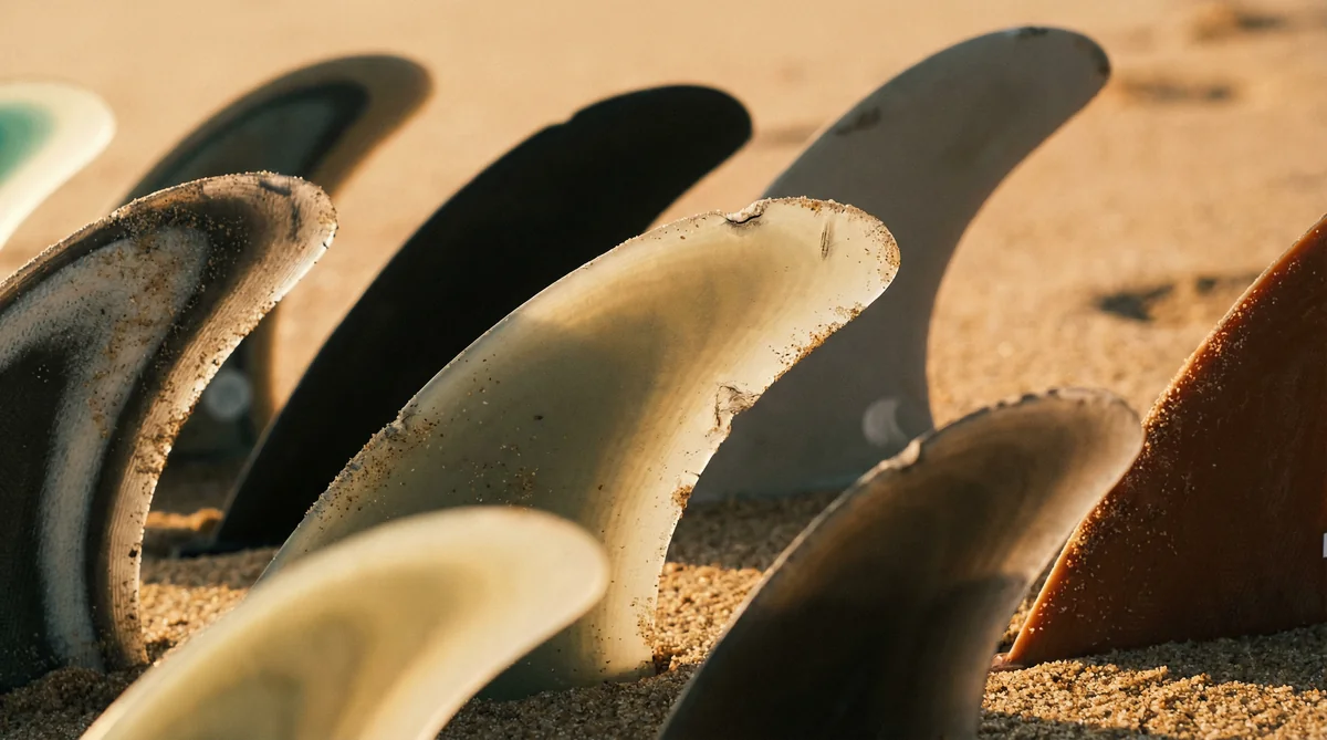
You're standing at the fin rack, staring at a wall of color. Reds, electric blues, that smoky carbon black, a pink set that looks fast just sitting there. You reach for the cool ones. Everybody does.
Here's the thing nobody at the counter will tell you while they're ringing you up. The color almost never matters. The red ones aren't faster than the blue ones. They're the same fin wearing different paint.
Surfboard fin colors are mostly cosmetic. What actually changes how a fin rides is the construction and the template, and both of those are hiding in the tiny letters and numbers you skipped right over. Let's fix that.
Do Surfboard Fin Colors Mean Anything?
Short version: no, not in any standardized way. There is no industry color code where green means flexy and yellow means stiff. FCS and Futures both sell the exact same fin in a dozen finishes. An AM template in fire-engine red flexes identically to an AM in matte black. You're paying for a paint job, not performance.
This trips people up because color codes are real everywhere else in gear. Wetsuit thickness, leash sizing, even ski bindings lean on color cues. Fins just don't. The brands chose aesthetics over a coding system, and then leaned hard into making the colorways look rad on a shop wall.
So when your buddy swears his clear-blue set "feels looser," that's the placebo talking. Or it's a different template entirely and he's crediting the wrong thing.
What Actually Changes the Ride: Construction
The real signal is construction, the material and layup the fin is built from. This is where the feel lives, and it has its own names that have nothing to do with color.
On the FCS side you've got a ladder. Neo Glass sits at the bottom, an injection-molded glass-and-nylon blend that's cheap, durable, and a little lifeless. Performance Core (PC) is the everyman pick, a foam core wrapped in fiberglass that feels lively and forgiving, the kind of fin that hides your mistakes. Performance Glass (PG) is layered fiberglass with no flex, stiff and precise and unforgiving. Performance Core Carbon (PCC) is the stiffest of all, carbon-loaded and snappy.
Drop a PC set in and the board breathes under you. You load a bottom turn, the fin gives a hair, then springs you out of it with this soft rebound that feels like the board is helping. Switch to PCC on the same board and it's a different animal. Every input goes straight to the rail, instant, no cushion, no forgiveness. Surf it tired and it'll punish you for it. We broke the full FCS materials lineup down if you want the deep cut.
Futures runs its own ladder with its own names. Thermotech is the entry plastic. Honeycomb is the middle, a fiberglass shell over a honeycomb core that gives medium flex and a predictable, no-surprises feel. Blackstix 3.0 is the wild one, a carbon build with a thinned foil that flexes and snaps back like a diving board. Pump down the line on Blackstix and you feel the tip whip, this springy little kick at the end of every turn that throws speed back at you. There's also Alpha, a light cellulose-composite construction that splits the difference.
The One Place Color Gives You a Hint
Okay, there's a small asterisk. Color won't tell you flex, but at a glance it can tell you which construction line you're looking at, because some lines have a signature look.
Blackstix are, predictably, black with a colored accent strip. Futures Alpha has a distinctive raw grey, almost industrial finish. FCS carbon constructions usually show that woven carbon texture instead of a flat color. So if you know the catalog, the finish becomes a loose shortcut to the build.
But that's pattern recognition for people who already know the lines. It's not a code. A beginner can't decode it, and even a vet can get fooled by a special-edition colorway. Read the box.
The Letters and Numbers Are the Real Map
Here's where the actual information lives. That stamp like AM, MB, JC, or a Futures code like F6, R8, P6, V2. Those are the template, the shape of the fin, and template is what controls drive, pivot, hold, and release.
The letters usually trace back to a shaper or pro. AM is Al Merrick. MR is Mark Richards. The numbers on Futures fins climb roughly with rider weight and the foil family. None of that is color. You could ride a yellow F6 and a translucent F6 back to back and not feel a single degree of difference, because they're the same template in the same construction.
This is exactly why learning to read the stamp beats shopping by vibe. We wrote a whole guide to reading a fin spec sheet, and a separate breakdown of what the big template names actually mean. Start there and the wall of color stops being intimidating. It becomes a menu you can read.
So Why Do Brands Sell Twenty Colors?
Because color sells. A fin is a small canvas and surfers like their gear to look good poking out of the tail. Pros run loud colorways for the cameras at Pipe and Trestles, the clear sets photograph clean, the team riders get custom paint. It's branding, and there's nothing wrong with that as long as you know what you're paying for.
Buy the color you love. Just don't let it drive the decision. A surfer chasing more drive in mushy beach break and a surfer chasing more bite in overhead reef need different templates and constructions, not different paint. The pink ones will not save you in head-high Blacks if the foil is wrong for the wave.
I Bought Fins by Color Once. It Taught Me Plenty.
Years back I grabbed a translucent amber set off a shop wall purely because they looked like honey in the light. Didn't check the stamp. Didn't ask. Just liked them.
Paddled out at a punchy little beach break the next morning and the board felt dead. Stiff, planky, no spring off the bottom. Turns out I'd bought a flat fiberglass template in a stiff layup, perfect for a fast point wave, useless for the slappy onshore stuff I actually surf. Same brand, prettier color, completely wrong fin.
The lesson stuck. The color told me a beautiful story and none of it was true. The two letters stamped on the base would have told me everything in half a second.
Key Takeaways
- Fin color is almost entirely cosmetic. There is no industry standard where a color means a specific flex or speed.
- Construction is the real feel signal. Learn the names: PC, PG, PCC, Neo Glass on FCS, and Thermotech, Honeycomb, Blackstix, Alpha on Futures.
- Template is the real performance signal. The letters and numbers on the fin (AM, F6, R8) control drive, pivot, and hold.
- Color can hint at construction only if you already know the catalog, since some lines have a signature finish. It's a shortcut, not a rule.
- Buy the colorway you like, then choose the construction and template based on your weight, board, and the waves you actually surf.
If the stamps still read like a foreign language, that's what the FinFinder recommender is for. Tell it what you ride and where you surf, and it'll point you at the construction and template that fit. Then go ahead and pick whatever color makes you happy.
Helpful Resources
Ready to Find Your Perfect Fins?
Use our expert fin recommender tool to get personalized suggestions based on your needs.
Try Fin Recommender